
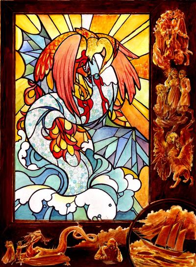
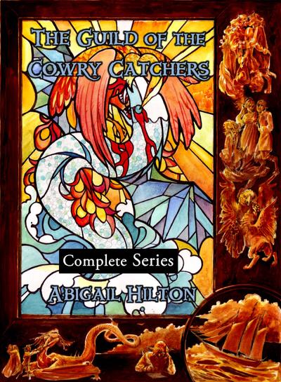
This is the new cover art by Sarah Cloutier for the Cowry Catchers Complete series. This is what it looks like lettered:
It's replacing this cover, an illustration from Book 1, which is too light-hearted and kid-friendly-looking to characterize the series:
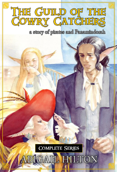
We did a lot of brain-storming to come up with this cover, and I polled a lot of people on what truly makes an adult fantasy cover. Responses to this question varied wildly. Many people also made the observation that my books are closer to mature YA or New Adult than to traditional adult fantasy. I'm OK with that. I just don't want them mistaken for children's books.
Hopefully the new cover has a darker, sexier, more violent feel. The stained glass is intended to invoke religious overtones. I hope that the large image is eye-catching, while the smaller images encourage people to click for a closer look. There's all kinds of stuff going on around that embossed edge. So go ahead. Clickie. :)
Note: The art is pretty much final at this point, but the lettering is nothing special and can be changed. Someone is already telling me that I shouldn't have matched the blood, because it's too much red in one place. However, gold is not high enough contrast. I actually considered leaving the lettering off of this one. I've seen authors doing that lately - just trusting to the title under the book and letting the artwork stand unlettered. What do you think? This book will never appear in paper, because it's too big, so this is an ebook-only question.